Mahagedara Foods Branding
Authentic Identity & Cost-Optimized Packaging for a Local Spice Brand
- Client: Mahagedara Foods
- Industry: Authentic Spices &Culinary
- Scope of Work: Full Brand Strategy &Identity
- Project Type: Startup Brand Launch
EXECUTIVE SUMMARY & CHALLENGE
Mahagedara Foods entered the competitive spice market as a grassroots local enterprise dedicated to producing
authentic, unadulterated Sri Lankan spices. The challenge was two-fold: the brand needed a distinct identity that
resonated deeply with local cultural nostalgia while standing out on supermarket shelves—all while adhering to a lean
budget typical of early-stage startups.
Rather than merely showcasing finished graphics, this case study details the strategic visual hierarchy, narrative
framing, and economic design decisions that allowed a startup brand to achieve high market visibility and reduce
packaging print production costs by 50% without compromising visual quality.
BRAND STRATEGY & NAMING STORY
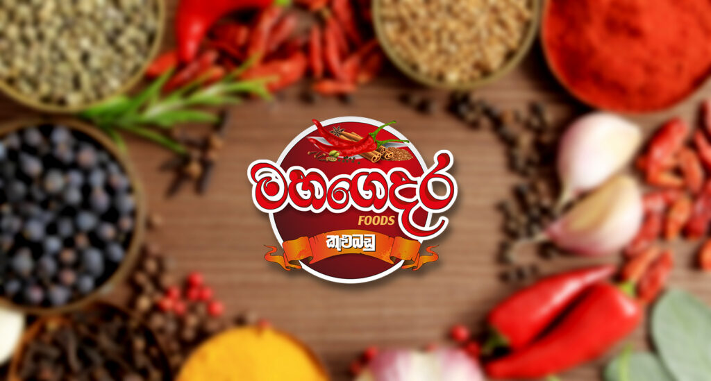
The Naming Narrative Market analysis revealed that established spice brands often tilt toward corporate coldness or artificial “luxury” aesthetics that disconnect from true home cooking. To create an emotional anchor, we tapped into the nostalgic concept of “Mahagedara” (මහගෙදර) —the ancestral family home.
During traditional New Year celebrations and family gatherings, visiting the ancestral home offers an irreplaceable, rich culinary experience crafted by grandmothers and mothers. The name Mahagedara Foods instantly evokes trust, heritage, pure ingredients, and warmth.
Strategic Market Positioning
Position: Rooted, Authentic & Traditional Everyday Cooking.
Tone of Voice: Warm, trustworthy, flavorful, community-centric.
Target Audience: Homemakers, culinary enthusiasts, and diaspora seeking authentic Sri Lankan flavor profiles.
LOGO ARCHITECTURE & COLOR PSYCHOLOGY
The visual identity was designed to reflect genuine warmth and culinary kick, deliberately avoiding an overly commercial or pretentious luxury aesthetic.
Color Psychology & Selection
A deep, rich spice-red palette was chosen based on visual psychology. Red stimulates appetite, conveys passion and warmth, and aligns with Sri Lanka’s iconic chili and curry culture.
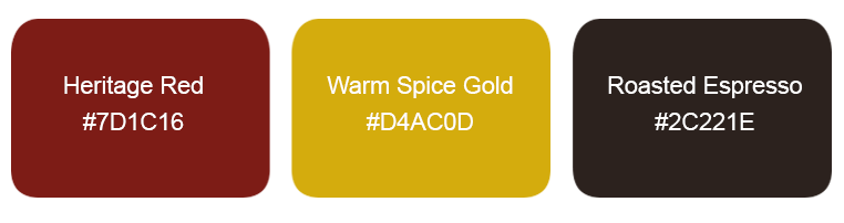
Logo Concept Breakdown
- Traditional Motif: Organic curvature symbolizing traditional clay cooking pots (මැටි වළඳ) and organic chili curves.
- Spice Kick Element: Subtle botanical graphic accents representing chili/spice seeds and natural warmth.
- Typography: Bold, ground-rooted serif typography combined with clean bilingual script compatibility for local shelf presence.
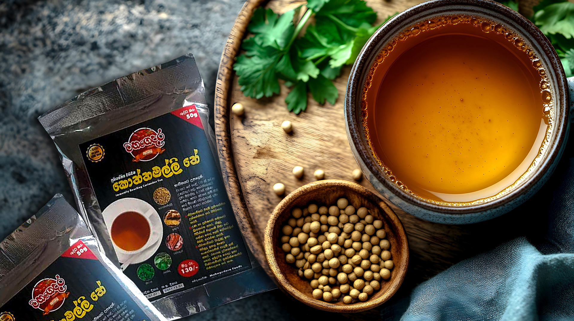
COST-OPTIMIZED PACKAGING & LABEL SYSTEM
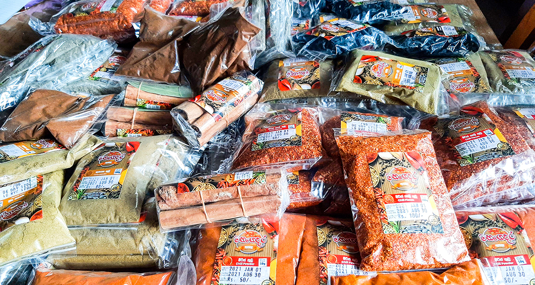
As a startup, budget management was critical. Producing multi-color custom packaging bags for multiple SKU variations (Chili Powder, Curry Powder, Turmeric, Pepper, etc.) is financially prohibitive for new businesses.
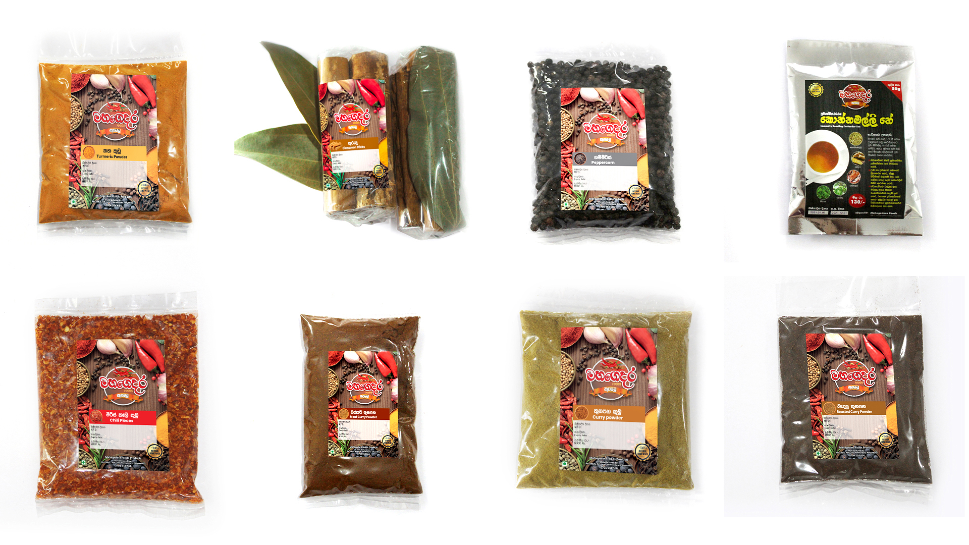
The 50% Cost-Reduction Strategy
Instead of separate expensive custom printed foil bags for each product, we designed a unified master bag layout combined with a standardized modular label printing system. By standardizing color palettes, die-cut sizes, and single-pass print layouts, label and packaging production costs were reduced by ~50% while maintaining a premium, cohesive brand aesthetic on shelf.
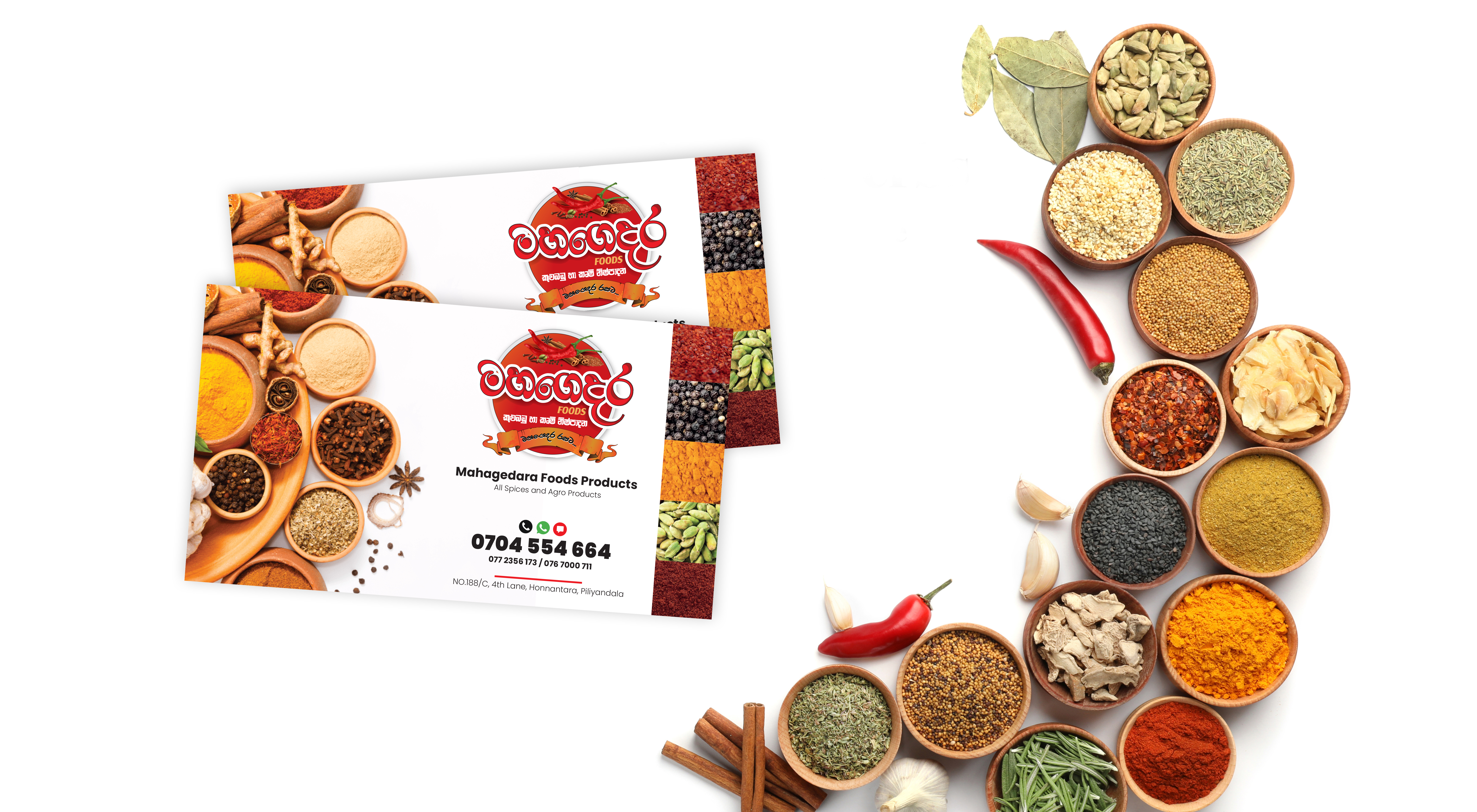
“Great design is not just about aesthetics; it’s about solving business challenges. For Mahagedara Foods, we
combined rich emotional storytelling with practical, cost-efficient print engineering to turn a small startup into a
compelling market presence.”
— Brand Identity & Packaging Design Case Study