Supun Industries
INDUSTRIAL BRAND IDENTITY CASE STUDY
- Client: Supun Industries
- Industry: Lathe Machine & Metallurgy
- Service: Logo Design & Brand Mark
- Project type: Industrial Identity Launch
Executive Summary & Design Brief
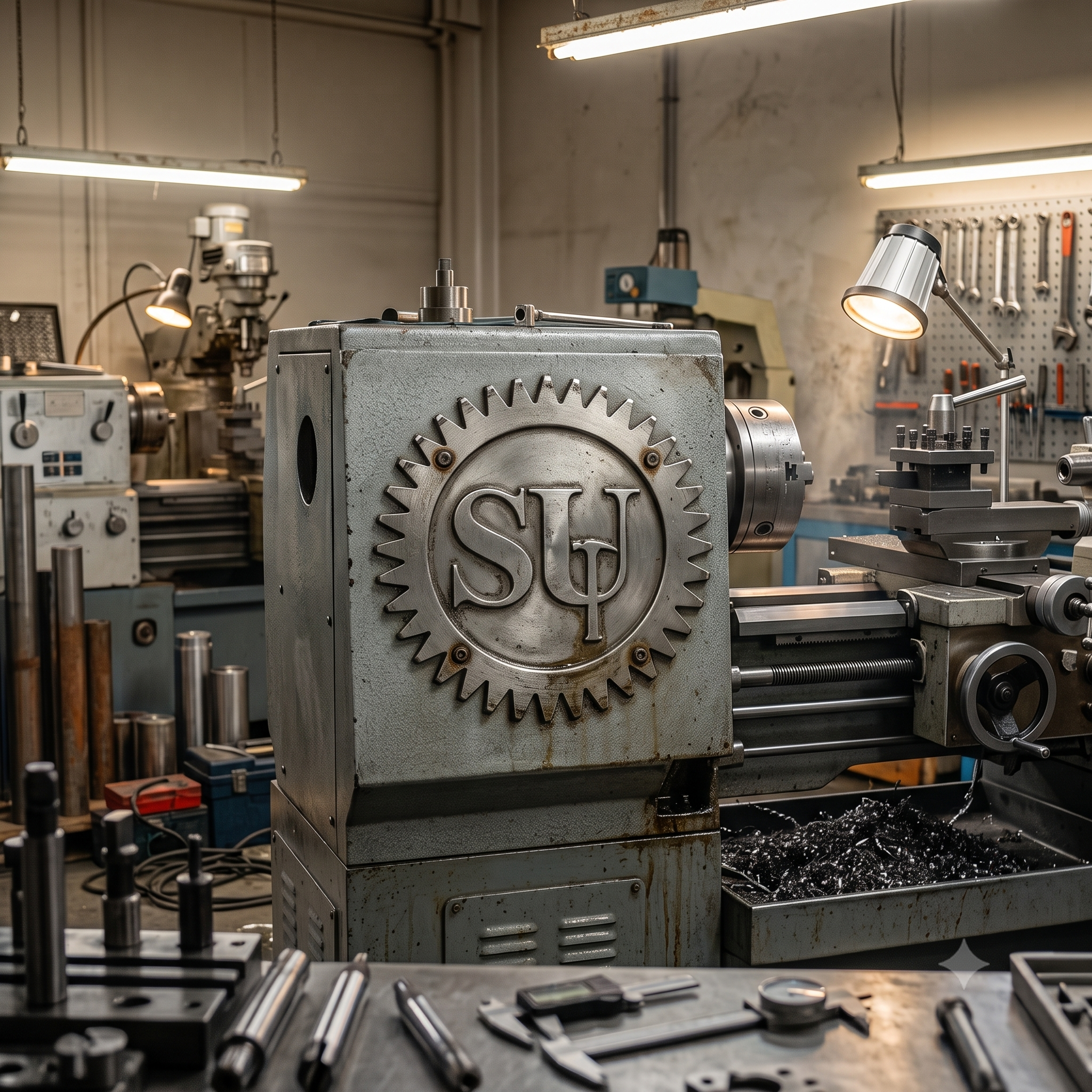
Supun Industries is a specialized lathe machine workshop and mechanical engineering enterprise focusing on precision metalwork, custom iron fabrication, and machinery repair. The primary objective was to build a robust, heavy-industrial brand identity that clearly reflects technical precision, durability, and hard-working craft.
Concept Strategy & Visual Metaphors
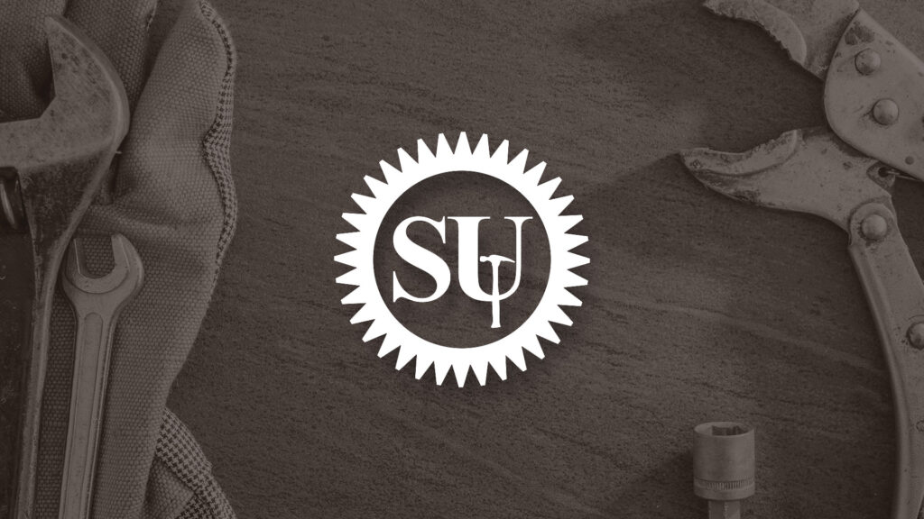
To ensure instant brand recognition within the industrial and mechanical engineering sectors, the logo mark combines symbolic elements representing mechanical motion and craftsmanship.
Symbolic Concept Architecture
- Monogram Abbreviation (“SU”): Derived directly from SUpun Industries, serving as a clean, memorable visual anchor.
- Gear Wheel (Cog): Symbolizes lathe machine operations, mechanical engineering, automated precision, and industrial movement.
- Hammer Iconography: Represents custom iron fabrication, craftsmanship, structural strength, and heavy-duty metalwork.
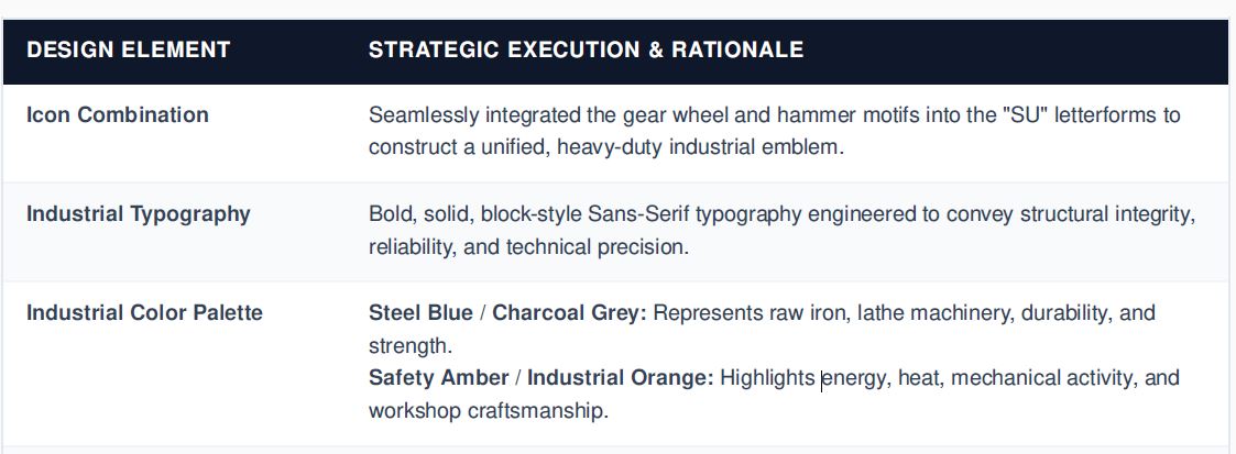
Design System & Execution Breakdown